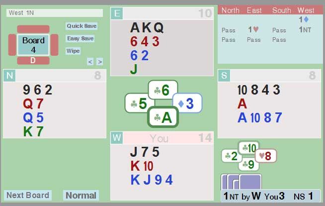
And can something be done to squish the "10" a bit?
I (and others) find the touching card format hard to read. A little bit of spacing would be so nice. In particular I find 'getting the hand shape' so very had with the current compact format. However, I do agree that you do want some positional 'jitter', a GRID of cards would also not work.
I know that this would be ultra hard to do for the javascript handviewer. But it is it a possibility for the flash app that most of the world now uses?
One suggestion - when I did a .lin player (see this BBO forum thread and the example image below). I created a small truetype font which had the capital "T" be reproduced as a "10" symbol. (see below) I also replaced a few characters with spaces of various widths. And so could add 'little spaces' to separate the cards.
I used the free FontForge font editor to make my font and embedded it in the app.

Yes - have started two separate threads today. The logic being two separate ideas, two separate threads. If this was wrong I apologise.
Even if none of my suggestions ever happens, I want to give a big thank you to everyone at BBO for the wonderful site.
--
Roger

 Help
Help


